


No Map? You’ll Get Lost!
When travelling to a new destination, do you like to guess the route or do you prefer the aid of directions?
When it comes to your website, you want to make sure the route to the desired action (whether that is making a purchase, submitting an enquiry, or signing up to the mailing list etc) is intuitive and easy to follow. Think of the desired action like the destination and the site navigation the map, guiding the visitor through the website.
However, despite being a crucial element of website design, navigation is often overlooked or not catered to the target visitor.
Making simple changes to your navigation can stop visitors getting lost and allow your site to benefit from improved:
Findability: Good navigation helps users find what they’re looking for on your website, quick.
Usability: Intuitive, clear, and easy to use navigation will make it easier for users to find what they need and improve the user experience.
Accessibility: Accessible navigation from any page of the website ensures the visitor journey is always simple.
Conversion: Less diversions and simple journey allows the user to get to the destination faster, increasing the likelihood of conversion.
SEO: A well-designed navigation helps search engines understand website structure and relationship between pages making the crawling and indexing of pages easier.

Designing your Map
The difficulty with website navigation is what seems obvious and intuitive to you, may not be the same for your target viewer. That’s why it is important to break down the navigation design process down into steps that incorporates the following top tips to achieve the balance between functionality and creativity:
The Navigation Bar
The first step to ensure your website navigation is intuitive, simple, and clear, is designing an effective navigation bar as this will be the primary mode of navigation between landing pages for the visitor. Remember, just having a navigation bar isn’t enough…a confusing and complicated navigation bar can actually make things worse!
When designing a navigation bar here’s what to keep in mind:
1. Keep it simple
Intuitive, clear, and easy to use navigation will make it easier for users to find what they need, improving the user experience. Use familiar and recognisable labels for your pages, and group them into logical categories. For large websites with many pages, mega menus are useful to reduce confusion and prevent visitors from feeling overwhelmed. Expandable mega menus allow multiple links to be displayed in a compact space without the need to scroll, making it easier for users to find what they need.
2. Visible and consistent
Make sure that the navigation bar is prominently displayed at the top of the website, and that it stays visible when users scroll down the page. This will make it easy for users to access the navigation at any time, and help them find what they’re looking for quickly.
Responsive Design
All good website designs are responsive, with navigation that is designed to work well on all devices and screen sizes. With the increasing number of people accessing websites on mobile devices, even in a business setting, it’s more important than ever to consider mobile navigation in website design.
When designing navigation that is responsive, here’s what to keep in mind:
1. Ease of use – Just like navigation on desktop, mobile navigation should be intuitive, clear, and easy to use.
2. Burgers for mobile – Similarly, simplicity and cohesion of labels and category grouping is key; potentially even more important due to smaller screen size. For mobile in particular it is useful to consider a hamburger menu as this will keep the navigation hidden when not in use, maximising the limited space available.
3. Accessibility – Additionally, it is essential that the navigation bar or hamburger menu is accessible by prominently displaying it at the top of the website, and ensuring that it is visible when users scroll down the page. This will make it easy for users to access the navigation at any time without the inconvenience of returning to the top of the landing page.
4. Optimise for touch – The navigation must work as effectively with a desktop click, as it does with the use of touch. Size and location of buttons in relation to one another may work well on desktop, but don’t always respond effectively to human touch. In this case it is beneficial to have a mobile specific navigation bar.
Test, Test, and Test Again
You may think the navigation of your website is intuitive but does your customer?
You must test your navigation with users, measure the success of your navigation, and make changes as needed. Don’t forget to test the website on different devices and screen sizes to ensure that it works well on all devices to avoid disrupting the user experience for any visitors and to maximise conversion.

Make Navigation Easier
We recommend the use of a WaaS (websites-as-a-service) provider to simplify the process of website navigation. A reputable and experienced provider will have the knowledge and expertise to work with you to create an intuitive website navigation design that enhances the user experience and makes the path to conversion simple. Additionally, they will implement the design, ensuring that the website development is carried out correctly and free from bugs.
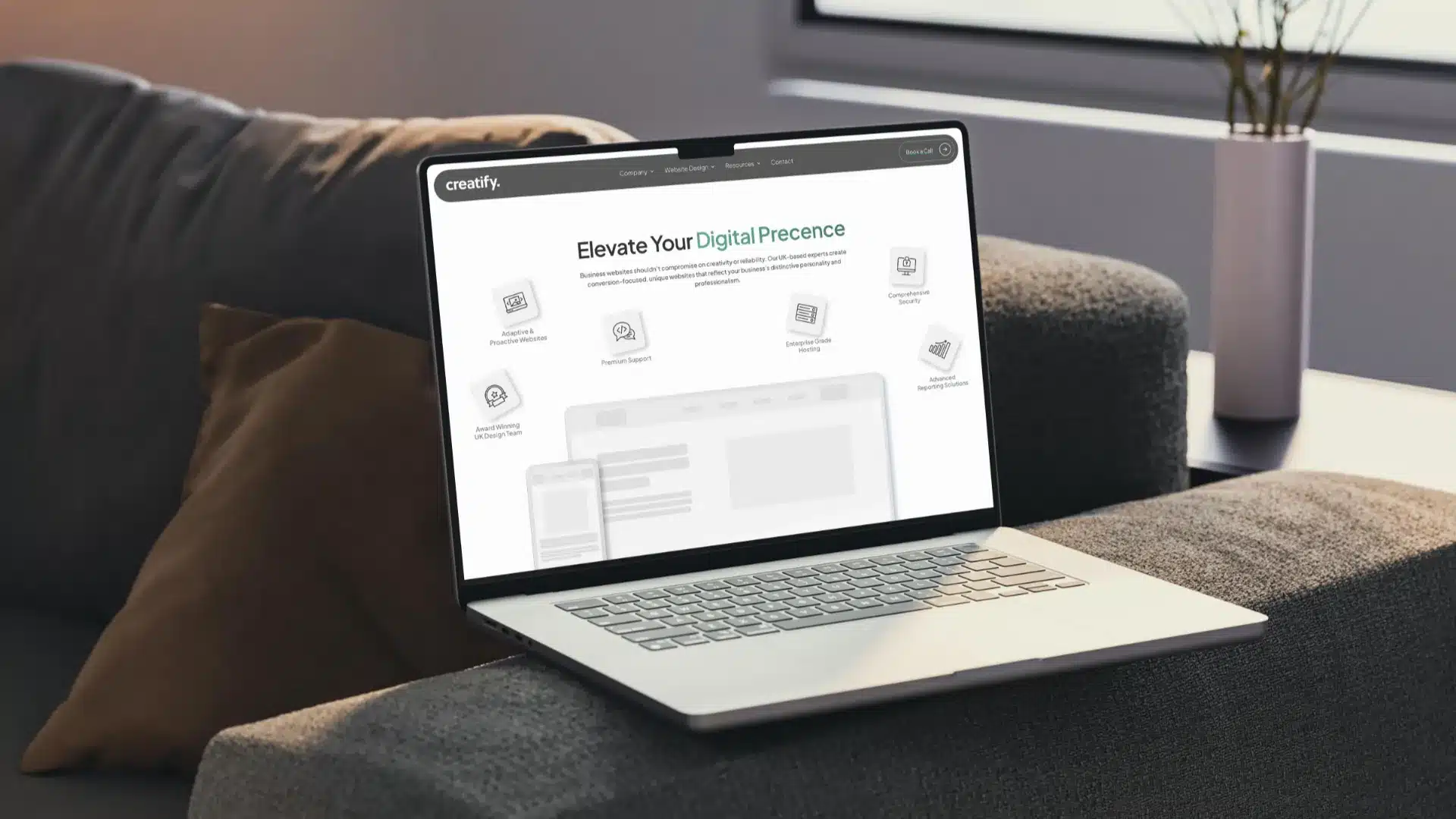
For example, WaaS provider Creatify has a team of expert web designers who have the necessary experience to successfully implement efficient and intuitive website navigation. Additionally, their monthly reporting and unlimited revisions policy allows you to evaluate website performance and make changes at no extra cost, providing greater flexibility.
